Case study Airplane MOBILE app
The client is an startup airplane mobile app. They want an intuitive app that will help their users fulfil their goal without friction. They realized that many airlines have a high dropout rate and wanted to understand why so they could step in and compete for those customers.
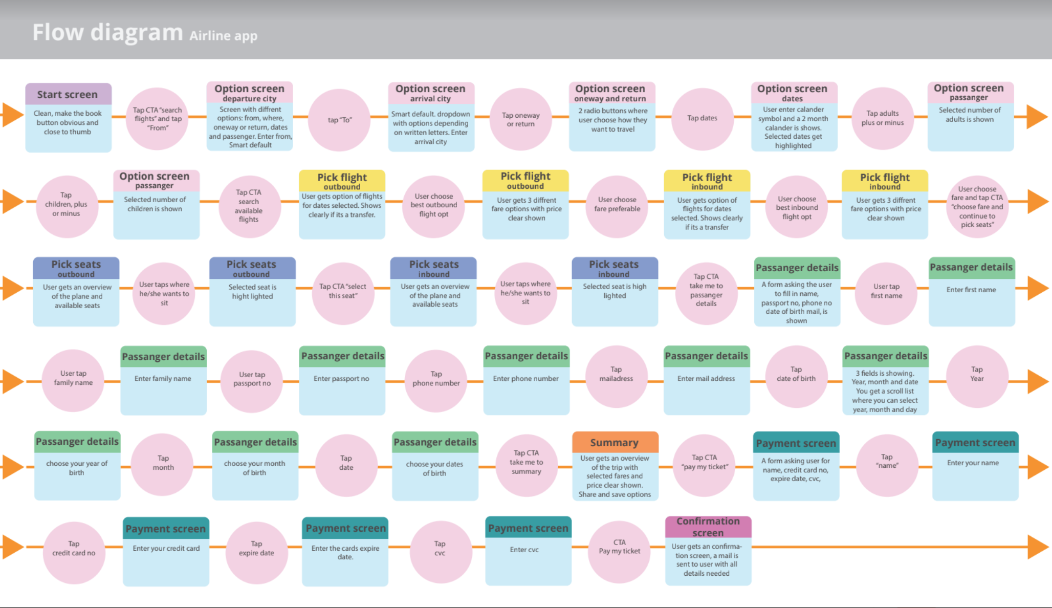
The research methods I used for this project were: Competitive benchmarking, online surveys, usability tests, affinity diagram, customer journey map and flow diagram.
01
RESEARCH
During my research I saw that a significant common feature among all apps was the lack of clear navigation. Important information, such as direct flights or 2 stops, was not apparent to the user until, in some cases, toward the end of the process.
Many also had a cluttered interface and most of the apps provided too much of information to the user, making it challenging to process, rather than guiding the user through the process smoothly.
With all this research behind me, I wanted to create an app that worked to provide the user with information when they needed it and that the flow and navigation would smoothly guide the user through the process.
02
SKETCHING
From all information gathered and before start sketching I defined a high-level flow for the mobile app. With focus on one flow and to address all the issues highlighted in my customer journey map.
This process felt more important than ever since flight apps have to display a lot of information and involve so many different steps. Which steps could be removed, and in which cases could certain information be hidden
03
CONCEPT INSPIRATION BOARD
I want the user to feel calm, happy, and secure when using the flight app. There should be no doubts; after all, a trip is a rather significant investment. Maybe incorporate a paper plane or a kite, something that is disarming for those afraid of flying and brings a calm and harmonious feeling.
I have used a subdued, tranquil color palette. In the language of color, purple symbolizes calmness and spirituality. Exactly the feeling you need when you're going to take some time in your daily life and book a trip.
A polite and calm app that greets the user politely and humanely. It's important to deliver a personalized shopping experience that stands out from the competitors.
Wireframes
I made sure to address all issues coming up during my research process. When I had a prototype I made new usability test to make sure I covered all pit falls.
My main mission in this project was to create a clear and clean navigation and make the user feel calm throughout the process. I also incorporated a personality, to interact with the user in a personal and friendly manner. It's important to deliver a personalized shopping experience that stands out from the competitors.
I incorporated a paper airplane in a graphic way to capture the feeling of tranquility.
Tools: Figma, Adobe illustrator
The prototype doesn't have all the features yet
If you are interested in seeing the entire process


